
Blackhawks prove Native American brand imagery can be done tastefully, do not need to change logo
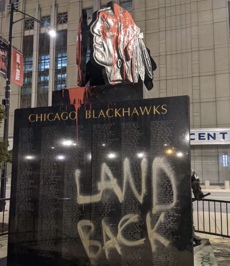
This Chicago Blackhawks statue outside the United Center was defaced on Indigenous Peoples Day earlier this year (original image from Twitter user @zhigaagoong)
December 12, 2020
Monday, Oct 12 of this year, the Chicago Blackhawks statue that sits outside the United Center, the venue where the team plays home games, was defaced overnight. A bucket of what appears to be red paint was doused over the statue’s logo, and messages calling for its removal were painted at the base. It was no coincidence that this occurred on Indigenous Peoples Day, formerly known as Columbus Day.
About a month later the NHL announced Nov 17 that it had collaborated with Adidas to design alternate Reverse Retro jerseys for teams to wear and sell this year. It wasn’t hard to see the obvious censorship of one team’s jersey on the @nhl Instagram account. The Chicago Blackhawks were the one team who’s promotional image depicted the sweater from the back instead of the front, with “Blackhawks 20” on the nameplate. The clear attempt to hide the team’s logo reignited debates over whether Native American logos and imagery were acceptable in today’s society.
The movement to ensure political correctness has never been stronger, as demonstrated this year when major brands such as Uncle Ben, Land O’Lakes, Aunt Jemima, and the Washington Redskins all underwent serious changes to their logos and brand identity to satisfy those they offended. The former Redskins, now temporarily dubbed the “Washington Football Team” made history in 2020 when they became the first professional sports team to change their name due to racist origins. Teams like the Atlanta Braves and Cleveland Indians have altered their logos, and colleges like the University of Illinois and Ole Miss have moved on from old mascots, but Washington is the first to go through a complete overhaul of the team’s name and logo.
One of the main arguments that come up with the discussion of this controversial topic is that Native American people should not be made into mascots because of their race. While I agree wholeheartedly with this statement, I do think people need to realize that there is a stark difference between a mascot/character and a logo design. Compare the Cleveland Indians and Chicago Blackhawks. While both logos portrayed the face of a Native American, the Blackhawks’ logo is clearly in much better taste. It depicts the beaming side profile of a Native American person who dons traditional tribal markings and accessories. The Indians’ old logo, intolerantly named “Chief Wahoo”, is a caricature of a Native American who has cartoonishly large facial features, a wide full-toothed grin, and literal red skin.
What sets these two apart aside from the obvious stylistic differences? Chief Wahoo is a character, it has a name and is portrayed doing various activities for the amusement of others. Its facial features have been so far exaggerated that it hardly resembles a human being. The Blackhawks logo is just a profile of a nameless person, similar to the Boston Celtics leprechaun or the Ottawa Senators soldier. There’s no exaggeration, the expression is beaming and passive, the accessories are historically accurate, the design itself is nothing but respectful. You could scour the crowds at Blackhawks games, or conduct a thorough Google search, you won’t find any signs or images depicting the face on a body doing various activities. This is because unlike Chief Wahoo, the logo is not a gimmick and a caricature.
When this discussion is had, a few organizations are continuously absent from the conversation. Seldom do you hear somebody say that Florida State University or the Kansas City Chiefs should change their names or logos. What makes them exempt from this talk? For FSU, it’s been their relationship with the original Seminole Native American tribe for whom they’ve been named. It’s well-known that the university has been giving the tribe’s blessing, the two parties have been working closely together to build a respect-based relationship for over 70 years. With the Chiefs, They are generally viewed as an example of how Native American branding can be done right. It is virtually impossible to be offended by their logo design, and their mascot, K.C. Wolf is a fan favorite despite having nothing to do with Native American culture. I mention these two teams because it is my firm belief that the Chicago Blackhawks embody the best of all of the aforementioned qualities.
Their work to acknowledge their origins, spread awareness about Chief Black Hawk, and fund programs to give back to the tribes they aim to honor can be found on their website under Native American Initiatives. While their relationship with the tribes isn’t yet on par with what FSU has with the Seminoles, the Blackhawks’ efforts and goals are evidence of real strides of progress and deserve more attention. As for the mascot, the Blackhawks have never used a mascot or character relating to their Native American theme. Their current mascot Tommy Hawk is a cartoonish black hawk who was named the NHL Mascot of the Year last season. Since he was introduced before the 2001 season, he has quickly become one of the NHL’s most recognizable and beloved mascots. Introducing Tommy Hawk was the Blackhawks’ way of confirming that they don’t support the mockery of Native Americans as mascots.
In 2014, when Bleacher Report ranked 50 best logos in all of sports, the Blackhawks came in at number 19. Ranked just one spot ahead of them was the Kansas City Chiefs. Thehockeywriters.com ranked Chicago’s as the fourth best logo in hockey, FOX Sports had them at number two. The icon level associated with the design is immeasurable and has surely brought amounts of awareness to the inspiring tribes that would be otherwise absent. Instead of discussing the removal of this logo along with the likes of Cleveland and Washington, It’s time to begin appreciating it as we do with FSU and Kansas City.